The floor is a major consideration when designing commercial interiors. The color of the floor is a key factor in determining the flow of the room. When choosing the right color for your floor, there are many factors to consider, such as the size of the space, the lighting, the industry you work in, the brand that you represent, and the mood and tone you wish to set for employees and visitors.
The color scheme chosen in the workplace can have a significant impact on everything from productivity, to wellbeing at work and even mood. It’s the same for visitors and customers. The colors you choose can influence how people perceive and interact with your brand, and even cause specific behaviors. We dive into color psychology to explain why you should take flooring aesthetics into consideration when redesigning your home.
Color Psychology
“Colors follow emotions, just as features do.” – Pablo Picasso
The color we see can have a profound effect on our emotions. They often subconsciously trigger memories or associations. Blue, for example, can evoke feelings of calmness, as it reminds us of a clear sky or a body of water. Yellow can make you happy, as it reminds you of a sunny, warm day, or may make you feel safer, because of its association with the daylight. When choosing a color for their logo, brands carefully consider all of their options. Colors are closely associated with successful brands. Red is the color that comes to mind when you think of Coca-Cola. Yellow for Best Buy, perhaps? What about Starbucks with its green mermaids?
Warm colors (reds, oranges, and yellows) and cool colors (greens, blues, and purples) are found in the color spectrum. Warm colors can evoke either anger or warmth. Cool colors can evoke feelings of calmness or sadness. Businesses that have a strong message of sustainability often choose green.
While this is changing, pink and blue are still seen as gendered colors. Keep in mind, however, that different people around the globe experience colors differently. Red is a good example. In India, red is associated with purity. It is also traditionally used for wedding dresses. In China, the color red represents happiness and luck. It is also the color of Chinese New Year. It is still associated with Communism in Eastern Europe.
What does this mean to the design of your commercial space and specifically, your choice of flooring?
Color Choice in Offices
We have covered how certain colors can evoke feelings or thoughts. Scientists found that by observing the changes in our body and brain, colors affect how we perceive and respond to an environment. This can be used by business offices to motivate employees and boost their productivity.
Color in the Workplace
Color psychology experts have determined that vibrant colors that stimulate creativity and increase productivity are the best for decorating a workspace. Green and blue are both common colors in nature and have been shown to improve focus and efficiency. They also promote a sense of wellbeing.
Red can be a powerful color, causing passion and increasing blood flow. Red is a great color to use to bring attention to an important feature or area in your office.
Yellow can represent energy and vitality. It is said to stimulate innovation, and it is best used when creative professionals are working in an environment. Neutrals and soft colors create more relaxing, comfortable environments. Office spaces benefit from off-white shades that give the room a natural glow.
The colors you choose for your office floor can have a huge impact on how your employees feel and behave. For more inspiration, click here.
Retail Environment Design
The most important thing in a retail setting is what’s for sale. What better way to grab the attention of a customer than with a floor color that complements the sale items? Floor color is a great way to create a unique experience for your customers, especially with the rise of online shopping.
What makes people want to visit your physical location? Combining the experience that you offer with an attractive and interesting design. Functionality is also important, such as features like comfort, sound absorption and easy cleaning. But you want a floor to make the space more inviting while enhancing your brand image.
Your floor color in a retail area should reflect your brand, and the mood you want to create for customers. Visit our retail flooring page to get more ideas.
The Power of Color for Your Restaurant
Colors can have a profound impact on the emotions of consumers, particularly when it comes food. Have you noticed that many restaurants, particularly fast-food chains use red in their branding and décor? It is because red stimulates your appetite, according to studies.
Jennifer Guerin is an interior designer and expert in color. She says that it’s best to steer clear of grays and blues while designing a restaurant. Gray suppresses appetite, and blues are not common in food.
When designing a dining experience, there are many things to consider. If your restaurant is farm-to table, organic or vegan, you might want to incorporate elements of brown to create a feeling of healthy, clean eating. To give your Mexican restaurant a fresh and fun energy, you can use a white background with bright pops of colors like pinks, yellows and blues.
There are so many options for colors, but it is important to balance the high energy with the calmness in your color scheme. Liquid Elements offers flooring that is customizable to suit your needs, whether you operate a small Southern Kitchen or an upscale Italian Bistro.
Why White Sterile Hospitals are a Thing of The Past
Color is as important in healthcare settings as it is in any other. White and its sterile, clean properties were the hallmark of healthcare facilities for many years. The days of cold, white, hospital are gone, despite their clean appearance. According to studies, hospital design has a significant impact on patient recovery and wellbeing. In hospitals, comforting color palettes are widely used.
Each of the colors blue, green, and purple can be soothing to patients. These colors are great for hospital rooms, spas and other wellness centers. Did you know, however, that red is considered to be energizing for dementia patients who require brain stimulation? Memory care is another application of red in senior living facilities. Red is not recommended for many patients, such as those who are in need of rest, since it can cause anxiety.
It is important in patient settings to create a sense balance and contrast by using distinct colors and saturations. The “coolness” of a room should be balanced by neutral, “warm” elements such as wood or cork. Bold contrasting colors are often used in children’s hospitals to stimulate or signal that the environment is one of playfulness and energy.
When choosing a flooring for a healthcare facility, cleanliness and hygiene should be the top priority. Liquid Elements floors prioritize this by providing easy-to-clean seamless floors that do not trap dirt or bacteria. Liquid Elements offers a variety of colors, including custom designs and colors for cafeterias, patient rooms and medical center corridors.
Color and Learning Environments
Students look for great schools in order to gain knowledge that will help them throughout their life. As you may know, there are many factors that go into choosing a college. The first visit to the campus is a big factor. Colors can influence students’ minds just as they can influence workers’ moods. Will I feel comfortable in this place? Will I be able to make friends here and feel comfortable? It will be a good place to study. Is it old, worn out, and outdated or is it modern, trendy, and up-to-date? Students and parents can find the right colors inviting. Once a student enrolls, they can have a greater impact.
Researchers have found a correlation between the physical attributes of school buildings, and student educational outcomes. Warm, bright colors, for example, are recommended in preschool and elementary schools because they complement the extroverted personalities of young students. Cooler colors encourage middle school students to concentrate and study carefully.
Colors can be used to help staff and students in higher education in a variety of ways, from enhancing their competitive edge in sports and university branding to navigating the campus more easily.
Do you have a culinary school at your two-year or trade college? Consider using a color scheme of white, black and red for your walls and flooring. This is a popular choice in restaurants. This color scheme is known to increase energy and encourage culinary students.
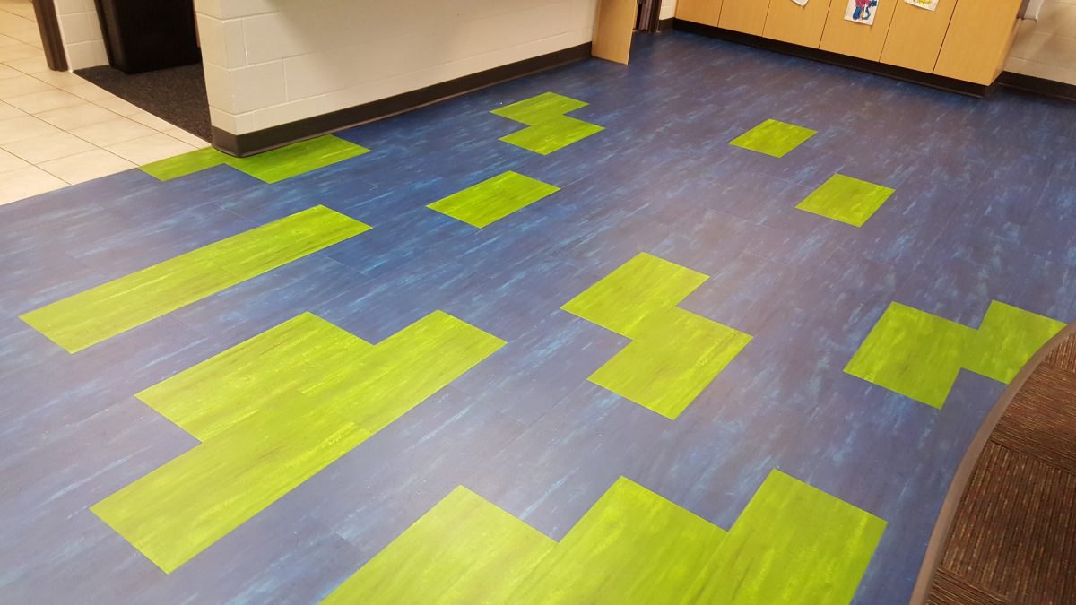
Have you ever noticed that the different wings of trade schools are colored differently? To make it easier to navigate through the halls, many trade schools color code sections of their buildings. Color placement on your walls and floors can help staff and students distinguish between learning environments.
Color palettes can be incorporated into the design of university facilities. To encourage school pride, university colors can be used in flooring and wall designs. Meanwhile, soothing shades in libraries and lecture rooms can improve concentration.
Want to intimidate a rival sports rival? Consider red flooring for the corridors that lead to the university’s sports complex. The matching of your college’s colors to the dining areas and interiors on campus can help students feel comfortable and consistent during their free time.
Choose your colors with purpose and care. Color schemes that are carefully coordinated can improve learning, navigation, and even create a sense of unity for your staff, students and guests.
Liquid Elements will help you to show your school pride by matching the flooring with your school’s colors. This will make it easier for students to learn. Liquid Elements floors are available in custom colors and offer superior slip resistance. They also have an acoustic pattern and are easy to clean.


